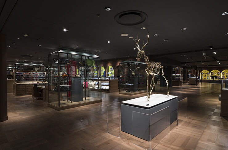
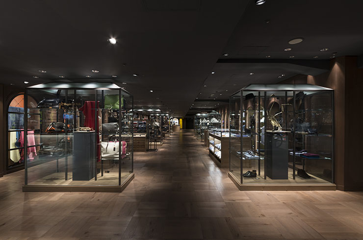
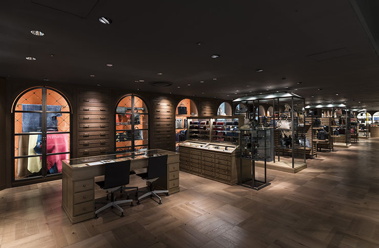
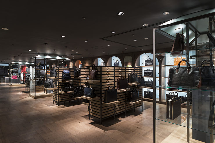
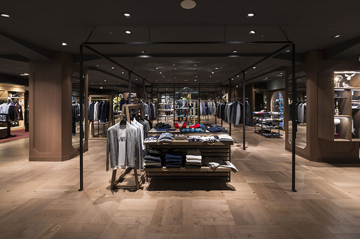
Targeting mature women and men with high sensibility, Seibu Shibuya required a new common environment between the women’s section of wing A, and the men’s section of wing B on their fifth floor. The floor originally had an open and neutral environment as many department stores do. For this project, we made a distinctive concept we’d usually do for stores on street-level, and reconsidered the division of spaces and lighting arrangement from scratch to create an intimacy.
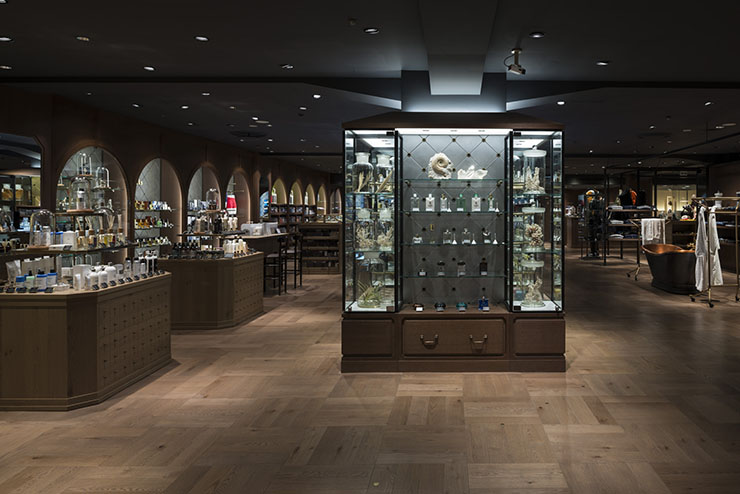
Wing B is a place where many items, such as hobby goods for mature adults, would gather and accumulate. We decided the concept for this wing to be an antiquity museum, where wonderful items would be collected and stored. We extracted “glass showcases,” “drawers,” “furniture looking like a display object,” “arches,” and other elements of an antiquity museum. Furniture of different styles in different heights were installed to create a nice rhythm in the space. We also had many discussions with the department store staffs, in order to find new ways of displaying as though it was a museum.
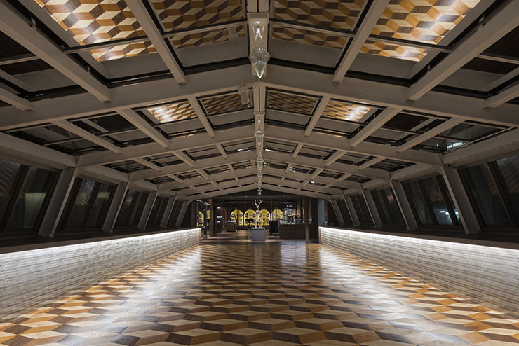
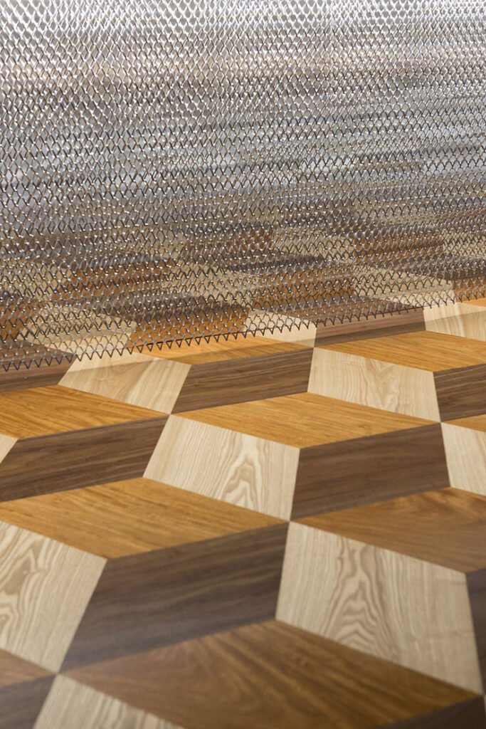
For the light environment, we made a rhythm in the showcases with some brighter and some darker, to create an intimate feeling within the rather dark interior. For the passage that connects the two wings A and B, we replaced the existing glass awning with gradient mirror films, which created a reflection onto the wood-parquet flooring that created a kaleidoscopic space.
A space where visitors would not only do their shopping, but would fully enjoy by just strolling around. Our intention for this project was to create a place that would go beyond the simply role of purchasing things, and create a place that would foster new experiences with new information, and a place that people would want to come back again.
Seibu Shibuya, wing B, 5th floor
Architecture
- Date
- - 2014.08
- For
- commercial
- At
Tokyo
- Size
- 1,465㎡
- Status
- Completed
Staff
- Direction
- Yuko Nagayama
Sahori Ohsawa - Photo
- Nobutada Omote


