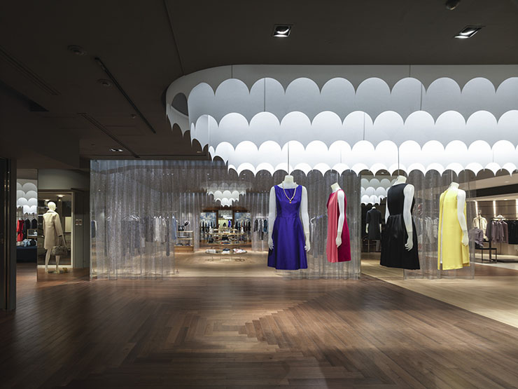
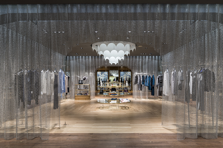
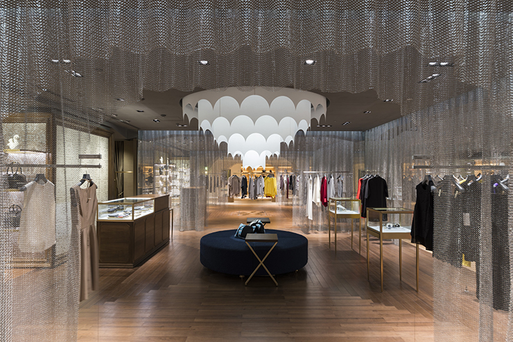
Targeting mature women and men with high sensibility, Seibu Shibuya required a new common environment between the women’s section of wing A, and the men’s section of wing B on their fifth floor. The floor originally had an open and neutral environment as many department stores do. For this project, we made a distinctive concept we’d usually do for stores on street-level, and reconsidered the division of spaces and lighting arrangement from scratch to create an intimacy.
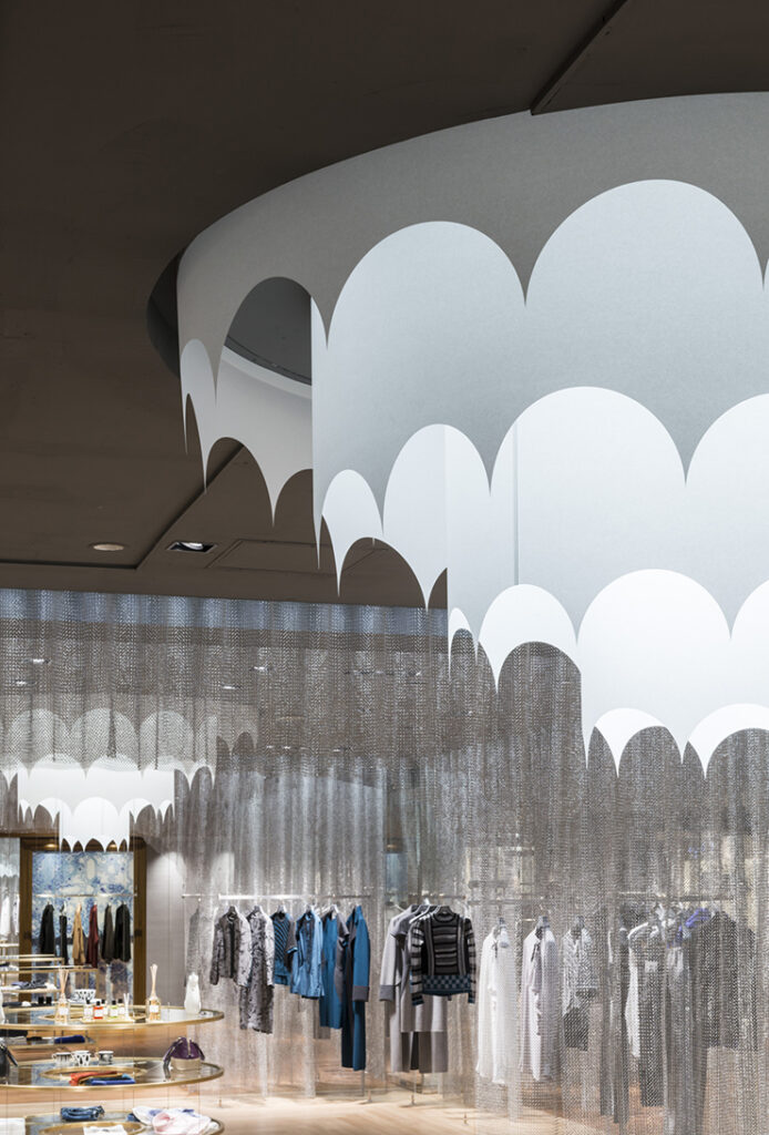
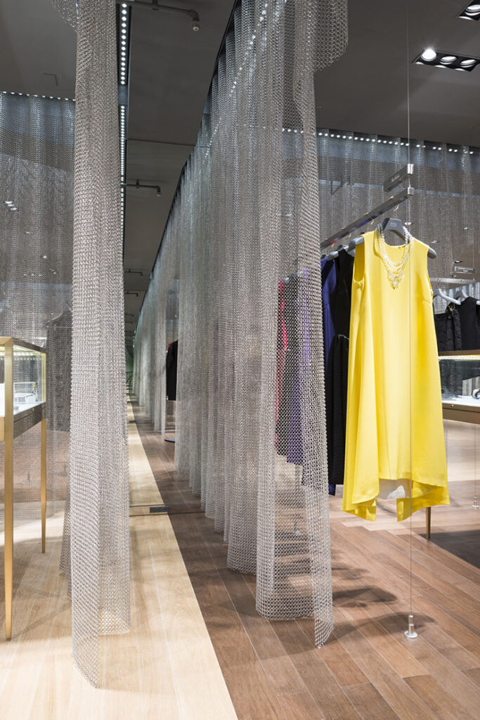
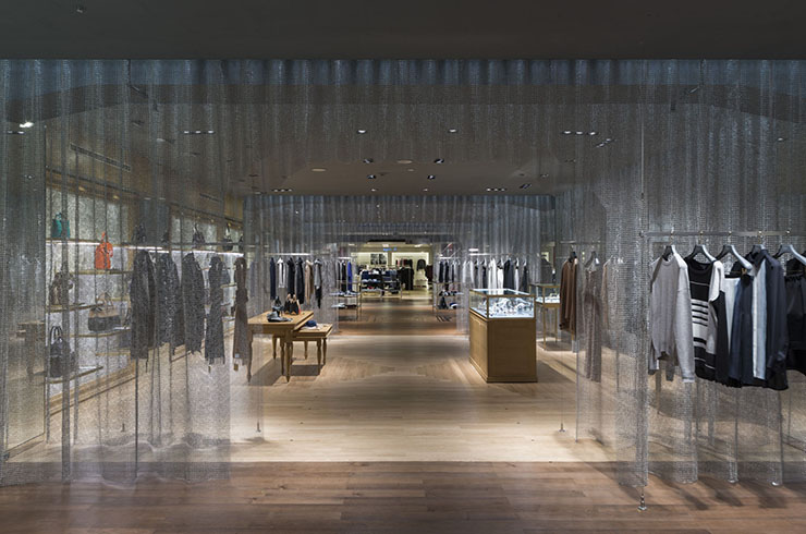
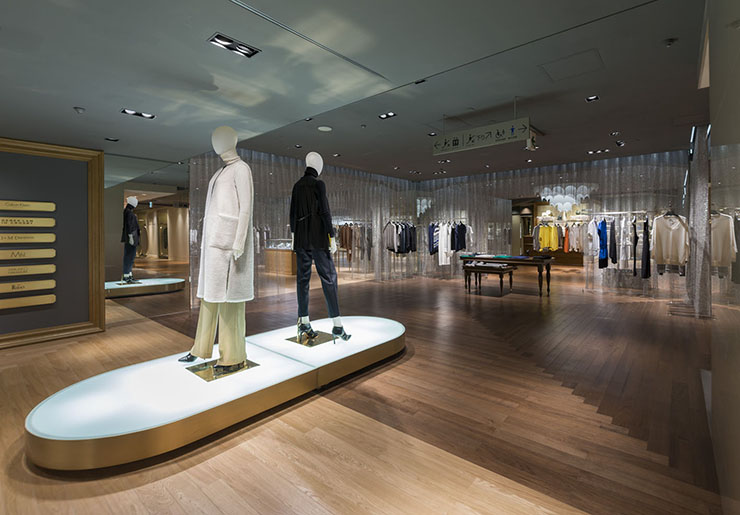
The concept of wing A was to create a space like a museum, with a structure of a palace. Many palace structures feature rooms that are continuously connected in a row. The special experience of walking through the luxurious space give an uplifting feeling. We created consecutive rooms are partitioned with transparent walls made of stainless steel ring mesh. Each rooms were given different themes, making their uniqueness with the colors of their floor finish and white shining chandeliers. The ring mesh erased the enclosed impression of the grid patterns of the columns and beams of the old interior.
A space where visitors would not only do their shopping, but would fully enjoy by just strolling around. Our intention for this project was to create a place that would go beyond the simply role of purchasing things, and create a place that would foster new experiences with new information, and a place that people would want to come back again.
Seibu Shibuya, wing A, 5th floor
Architecture
- Date
- - 2014.08
- For
- commercial
- At
Tokyo
- Size
- 948㎡
- Status
- Completed
Staff
- Direction
- Yuko Nagayama
Sahori Ohsawa - Photo
- Nobutada Omote


